
A new emblem for a new era
A new emblem for a new era
- August 6, 2025
- Posted by: Sitefun
- Category: News
Witness the evolution of an icon, as Bentley unveils a new emblem for the future that seamlessly blends our rich history and innovative vision for the future.
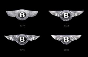
It’s hard to think of a logo more iconic than the Bentley emblem. Since its first iteration in 1919, the bold center jewel and graceful wings have symbolized over a century of performance, power and prestige. And now, it takes flight once again, ushering in a new era of innovation and possibility.
Led by Robin Page, Bentley’s Design Director, the task of designing the new Winged B began a year and a half ago. “We have only changed the emblem and logo four times in 106 years of Bentley history, so it’s quite a rare moment,” explains Page. “Designs were proposed that presented a low, medium, and high change. The low change was far too subtle, and people could hardly tell the difference. Medium was good, but was it enough? We ended up choosing the high change and started the process from there.” The final design was proposed by Young Nam, a member of the Interior Design team, and it was then developed and expanded into the final striking emblem now revealed.
TRADITION EVOLVES
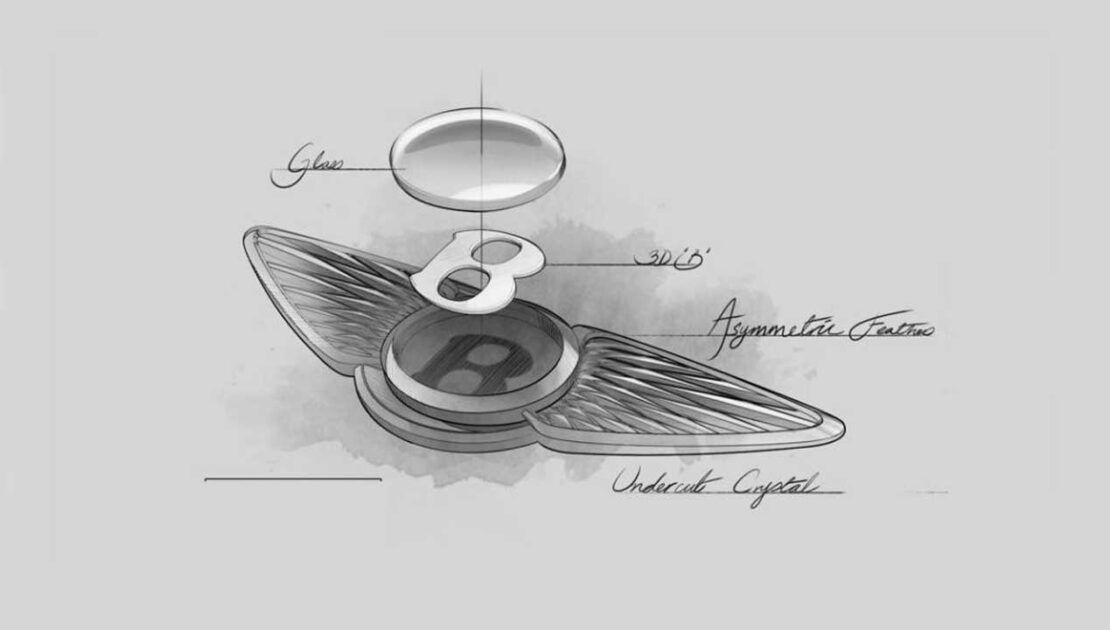
The final emblem is a true celebration of Bentley’s past, present and future, creating a symbol that honors the legacy that paved the way for the incredible success of the brand. “The original logo from 1919 had diamonds in the wing pattern, and they were almost secondary feathers to the primary wings,” says Page. “We took inspiration from that element of the 1919 logo, but we really wanted to modernize the wings.” For this, inspiration came from the sky. “I compared the 2002 logo to an owl; it has softer feathers and tail feathers. This year’s emblem now relates more to a peregrine falcon; the wings are sharper, faster and we’ve taken away the tail feathers to get more speed.”
And for the crowning jewel at the center of the Winged B? “We took influence from watchmaking. It has chamfered glass on the outside and a three-dimensional ‘B’ in the center. It gives a far higher value to the center jewel than we’ve ever had before.”
SHAPING THE FUTURE
Revealed on the groundbreaking EXP 15 concept car, the new emblem seen in situ provides a glimpse of the future. With its ultra-modern exterior and high-tech interior, the EXP 15 presents the perfect canvas for a vision of what is to come from the iconic marque. Page explains that “with the opening of the new Design Studio, the reveal of the vision car and with the pre-lead up to our first fully electric car, we thought it was the right time to change the emblem. The fact it’s only been done four times is a signal that these are quite rare moments in time. It’s a key point in the history of the brand.”
HONORING THE PAST
The design DNA that makes Bentley so unmistakable is still front and center within the new emblem. A closer look at the emblem reveals that the wings are not quite symmetrical. That’s no accident; it’s a tribute to our earliest design, which featured an uneven number of feathers as a subtle signature of authenticity. When Rolls-Royce took over, they unknowingly straightened things out, only to correct it years later to retain the original Bentley spirit. Today, that deliberate imperfection endures; an intrinsic thread connecting past to present.
Legacy is woven throughout every aspect of the Bentley brand, and the new emblem is the latest impactful iteration in a long line of recognizable marks. The emblem of today is far more than a logo on a car; it’s a shining beacon that leads the way into a future full of innovation, progress, and exploration.
HERITAGE REIMAGINED
Leave a Reply
You must be logged in to post a comment.